The Ideation Process
Ideation refers to a creative process involving the generation, development, and communication of new concepts, which are understood as the primary idea, which can be visualized or deducted in terms of empirical values. Ideation involves various thought cycles, ranging from innovation, development, and finally to actualization, which enables for data visualization and design (Kirk, 2016). For instance, the manufacture of any particular product starts from creating arranged thoughts, finding relevant information, and simulating the collected data to find connections with reality.
The current study focuses on aspects of digital online learning based on the effects the Blacks and Latinos face due to the COVID-19 pandemic. The pandemic resulted in sending students to learn from home, which meant there was a need for them to access computers and the Internet (Lwin et al., 2020). This survey explored the data collected by the United States Census Bureau as of 2021. The figures which relate to the availability of computer and the Internet in different households are critical to understanding how different categories of people, especially, races, access these resources.
The work initially involved setting the study’s expectations through hypothesis formulation. It was forecasted that Blacks and Latinos are more affected by the COVID-19 pandemic learning environment. This indicated that these two communities were more likely to lag in terms of accessing their education online. In the course of the survey, other relevant data regarding the age, level of education, and household incomes were also explored on their immediate roles in having a computer and access to the Internet.
Charts
The current study has utilized three types of charts to visualize the data to understand its behavior, thus informing the topic under investigation. According to Madanagopal et al. (2019), various visual aids enable the targeted audience to understand the data faster than through empirical analysis. Caporaso et al. (2020) agree with Madanagopal et al. (2019) by indicating that charts such as radars, column charts, and area charts show the trends of the collected data. Other chats frequently used in data presentations include line graphs, bar graphs, and pie charts.
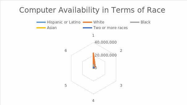
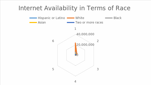
A radar chart is one of the graphical approaches used to present multivariate data. It gives a two-dimensional relationship for two or more data points represented in its various axes, beginning at the origin or the center of the chart. The position and angle of the different axes do not have much information regarding the data, though its various heuristics enable the sorting of the variables based on their relative positions. For instance, the spokes’ length is proportional to the variable magnitude referring to the data point close to the maximum value of any specific variable (Wiens et al., 2018). The plots help reveal how the variables are correlated or provide a further understanding of other measures used in the study (Liu & Nesbit, 2020). In this case, the radar chart has been used for the computer and Internet availability in terms of race. The charts in Figures 1 and 2 below show a wide gap between the Whites and other races regarding access to a computer and the Internet. The data visibility on Blacks is low, indicating the inadequacies they face in accessing these two resources, which are essential in online learning.
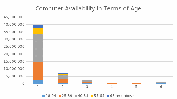
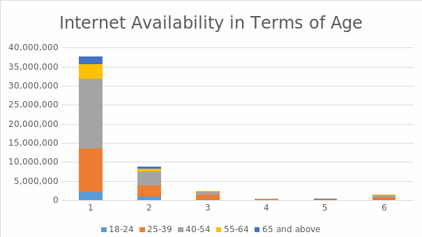
Column charts are also crucial in data visualization as they give an immediate impression of the variables relative to each other. Specifically, this chart achieves this function by representing variables in terms of rectangles, with the height of each rectangle expressing the proportion of the variable relative to the others which are being plotted (Leung et al., 2020). Column charts enable stacking the different variables and sorting them according to the specific questions asked in the survey. For example, in Figures 3 and 4, the column charts represent the data on the Internet and computer availability based on the participants’ ages.
Two stacked column charts have been used to present the visualization of computer and Internet accessibility. One of the readily visible outcomes indicates that the accessibility of both computers and the Internet is mostly always achieved among people aged between 40 and 54 years. This can be understood from the point that this category of individuals is mainly settled and tend to have the resources used to acquire these resources, as indicated by (Kenrick, 2017). However, this also suggests that they are more inclined to be the ones who can benefit most from online learning.
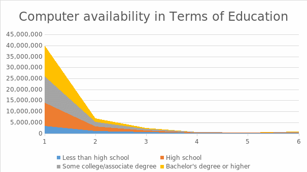
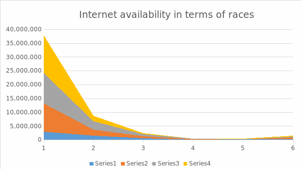
The other chart used is the area chart, which shows the weights of various variables used in the study. According to Po et al. (2020), an area chart is used to visualize how a variable changes throughout the study. It is closely related to the line graph since plotting and connecting the data points are achieved through the same process to indicate varying quantities at multiple times. Area charts help visualize a data trend over a period or a range of scales used in the survey (Healy, 2018). For example, one can visualize the movement of the data and determine if it rises or falls, as shown in figures 5 and 6.
This chart was relevant in the current survey, seeking to understand the Internet and computer accessibility among different participants. The subjects were asked to respond based on how readily they could access these two resources for their online learning. The participants were expected to provide a range between always being able to access the two resources and not getting them. Consequently, the outcome shows that there was much weight on the left of the graph, which indicates the ease of accessibility. There was a consistent reduction in the number of people who cannot access a computer and the Internet. This suggests that most participants can access the two resources, though the cumulative outcome is not readily evidenced in this specific data visualization approach.
Flow of Information for the Visualization
The data visualization tools used in this project provide a straightforward way to check the flow of information presented. Various charts can enable the audience to visualize the data differently based on the structure and appearance of the visualization (Sun et al., 2019). For example, in the column and area charts, one can determine that data flow from the left towards the right of the graphs. For instance, one can understand that the data reduce as they move along the charts. However, on the radar chart, the eye moves from the center towards the outer line of the graph. This is so because most of the data points are located next to the origin, with a few points on the outer lines.
Even though the data visualization tools used in this project are easy to understand, they may leave one wondering about some data elements. For instance, it is critical to question various empirical values such as the averages, the totals, and the differences between the maximum and the minimum values. However, it is also critical to understand that all these functions cannot be achieved through the same tool, so it is essential to have other analysis approaches, such as descriptive statistics. It is due to the idea that the charts are inadequate empirical tools, that statistical analyses are conducted, as have been done in this project.
Conclusion
Data visualization is critical in presenting the outcome of any survey. In the current project, three different tools, including radar, area, and stacked column charts, have been used to visualize the dataset used in the study. However, since these visualization tools do not readily provide answers to critical questions, such as means, distributions, and sums, descriptive statistics have been used to reveal the dataset’s nature. The tools have made it possible to visualize and understand the various elements of the dataset fully.
References
Caporaso, T., Grazioso, S., Di Gironimo, G., & Lanzotti, A. (2020). Biomechanical indices represented on radar chart for assessment of performance and infringements in elite race-walkers. Sports Engineering, 23(1), 1-8.
Healy, K. (2018). Data visualization: a practical introduction. Princeton University Press.
Kenrick, D. T. (2017). Self-actualization, human nature, and global social problems. Society, 54(6), 520-523.
Kirk, A. (2016). Data visualization: A handbook for data driven design. Sage.
Leung, C. K., Chen, Y., Hoi, C. S., Shang, S., Wen, Y., & Cuzzocrea, A. (2020). Big data visualization and visual analytics of COVID-19 data. In 2020 24th International Conference Information Visualisation (IV) (pp. 415-420). IEEE.
Liu, A. L., & Nesbit, J. C. (2020). Dashboards for computer-supported collaborative learning. In Machine Learning Paradigms (pp. 157-182). Springer.
Lwin, M. O., Lu, J., Sheldenkar, A., Schulz, P. J., Shin, W., Gupta, R., & Yang, Y. (2020). Global sentiments surrounding the COVID-19 pandemic on Twitter: Analysis of Twitter trends. JMIR Public Health and Surveillance, 6(2), e19447.
Madanagopal, K., Ragan, E. D., & Benjamin, P. (2019). Analytic provenance in practice: The role of provenance in real-world visualization and data analysis environments. IEEE Computer Graphics and Applications, 39(6), 30-45.
Po, L., Bikakis, N., Desimoni, F., & Papastefanatos, G. (2020). Linked Data Visualization: Techniques, Tools, and Big Data. Synthesis Lectures on Semantic Web: Theory and Technology, 10(1), 1-157.
Sun, G., Li, F., & Jiang, W. (2019). Brief talk about big data graph analysis and visualization. Journal on Big Data, 1(1), 25.
Wiens, J. P., Goldstein, G. R., Andrawis, M., Choi, M., & Priebe, J. W. (2018). Defining centric relation. The Journal of Prosthetic Dentistry, 120(1), 114-122.