Some authors decide to use various visuals, including charts, graphs, or images, in their works to make the latter more informative. Visual materials can be helpful because they represent data schematically, which allows readers to understand it better and faster. However, not every chart or graph is effective because it can be used inappropriately. The essay will present two examples of visuals that were misleading and unethical.
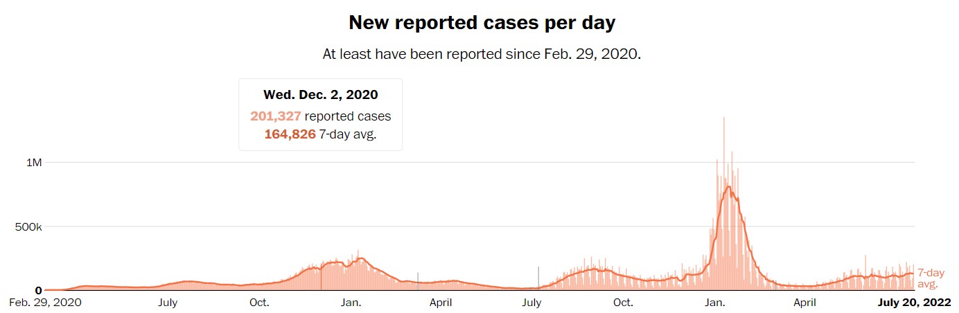
To begin with, one should explain that graphs are helpful in demonstrating how a particular phenomenon changes quantitatively over time. This feature became widespread with the onset of the COVID-19 pandemic, and the first visual in the paper focuses on such a graph. Figure 1 by The Washington Post (2020) reveals how coronavirus incidence has changed in the United States. This visual is misleading because a distortion is present that makes it challenging to understand the meaning. The y axis only includes three values, which implies that slight changes in the incidence are less obvious, and Roen et al. (2022) admit that such a case is typical. That is why it could be useful to reduce the scale of the visual.
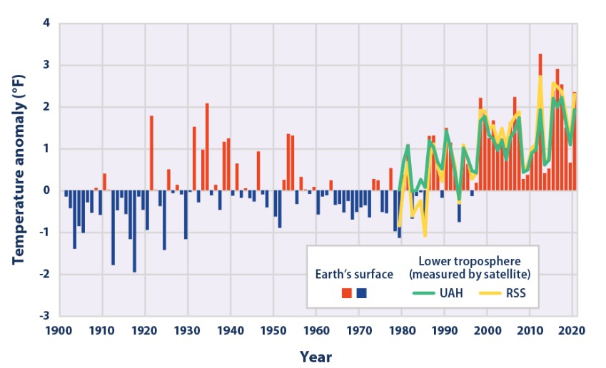
The second visual under consideration focuses on temperature changes from 1901 to the present time. The United States Environmental Protection Agency (2021) created Figure 2 to demonstrate how the environmental conditions have fluctuated. The chart can be considered misleading because it covers an extended lifespan and presents much information. Now, it is challenging to understand what those bars mean without reading the report by the United States Environmental Protection Agency (2021). The visual can be improved by limiting the content to describing fewer properties.
In conclusion, the essay has demonstrated that not all visuals are effective. Some charts and graphs can be misleading if they are created inappropriately. It occurs if wrong scales are chosen or when a visual intends to cover present large datasets. This information demonstrates that authors should be careful about creating and including any figures in their papers to ensure that these elements result in positive outcomes.
References
Roen, D., Rankins-Robertson, S., & Maid, B. M. (2022). The McGraw-Hill guide: Writing for college, writing for life (5th ed.). McGraw-Hill Higher Education.
United States Environmental Protection Agency. (2021). Climate change indicators: US and global temperature. Web.
The Washington Post. (2020). Tracking US Covid-19 cases, deaths, and other metrics by state. Web.